One of the earliest areas where I could 'stretch my legs' was the design of the user interface, i.e. how the hell I was going to control all this and also know what the hell it was doing. I still knew nothing about how I was going to do the electronics, but I was sure going to make my life as difficult as I figured I could make it. Lets try that sentence again, shall we. I came up with ideas for the user interface based on what I thought I could design and 'make work.' As I did more research and learned more about more components/code/methods, that design for the user interface evolved and changed. Lets get stuck in.
Here's something new for everyone, some actual excerpts from my notebook. Appologies for the shite quality, I used my phone since I'm too lazy to use the scanner.
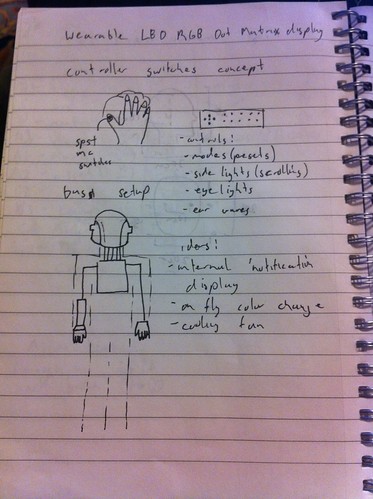
Good luck understanding the hieroglyphs I call hand writing.
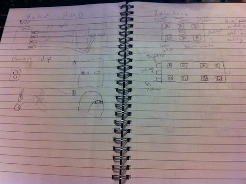
This one is a bit more interesting. On the right, You have the layout of an 'arm controller' design that I came up with. Obviously, this was more in keeping with the original costumes, which used arm mounted control panels. Needless to say that has it's difficulties.
On the left is something rather interesting. Probably my first stab at the idea of a 'heads up display.' It's a bit hard to see, harder still to understand, but the idea was to use a handful of RGB LEDs as status indicators. The real interesting idea was to use fiberoptic strands to 1) allow for remotely locating the LEDs based on the space constraints in the helmet, and 2) reduce the brightness somewhat by having the fiber not pointed in the eye but more of a 'peripheral glow.' Also I had the idea of using a 7 segment display or a alphanumeric segment display and a mirror to provide a peripheral indicator. I actually got that idea from the SEGA laser tag guns once upon an age ago.
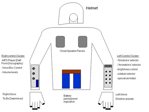
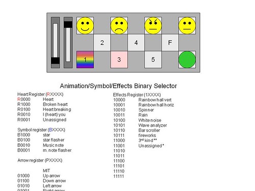
Eventually, this concept evolved into what you see above. The idea was two arm controllers. One for controlling the display, and one for controlling the playback of sound (since sound was one of my major goals). I had a handful of ideas on how I could use the buttons on the display controller, one being binary 'combinations' that's very much like dip switch inputs. The first button would select the group, the second would select the dominant feature, the next would alter that feature, so on and so forth. Needless to say it was going to involve a lot of memorization of button combinations. And of course, I had linear potentiometers, because everything is better with sliders.
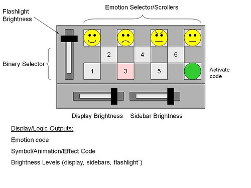
That was the most comprehensive, and complicated, interface I came up with. It was like the what the relay did before the transistor was invented (or mass deployed). You'd be surprised how complicated a circuit you can built with switches and relays. This was like that. It was nested menu of button presses and combinations, without giving clear feedback of what was going on. An old analog aircraft cockpit compared to the modern 'glass cockpit' digital display designs we see today.
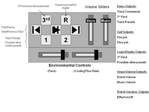
This interesting setup got replaced with the design I field currently. I'll give you a hint, it's infant concept is present in the overall design. It's just an immature version of it. We'll cover that in the next installment of DPHP.
No comments:
Post a Comment